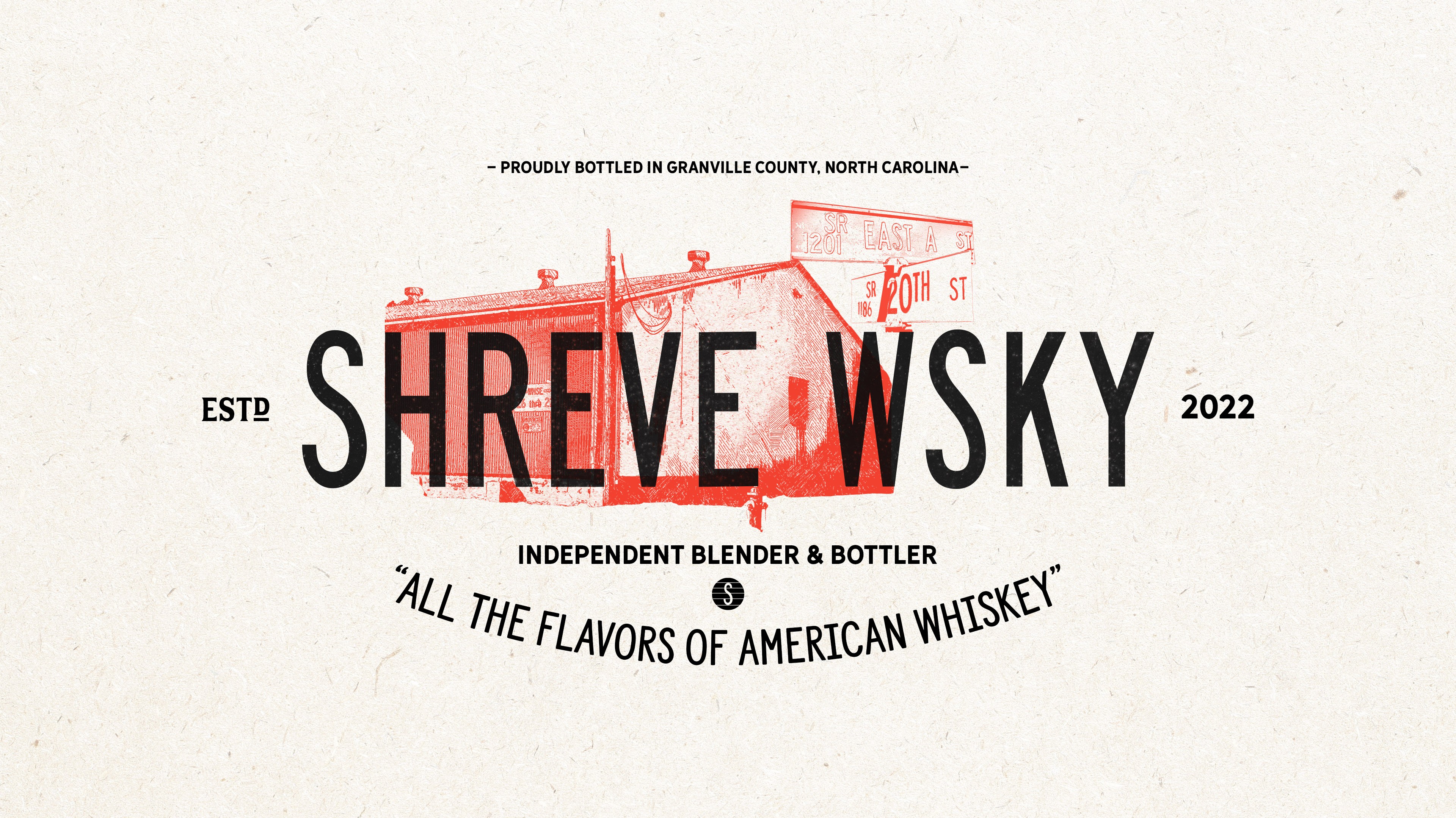
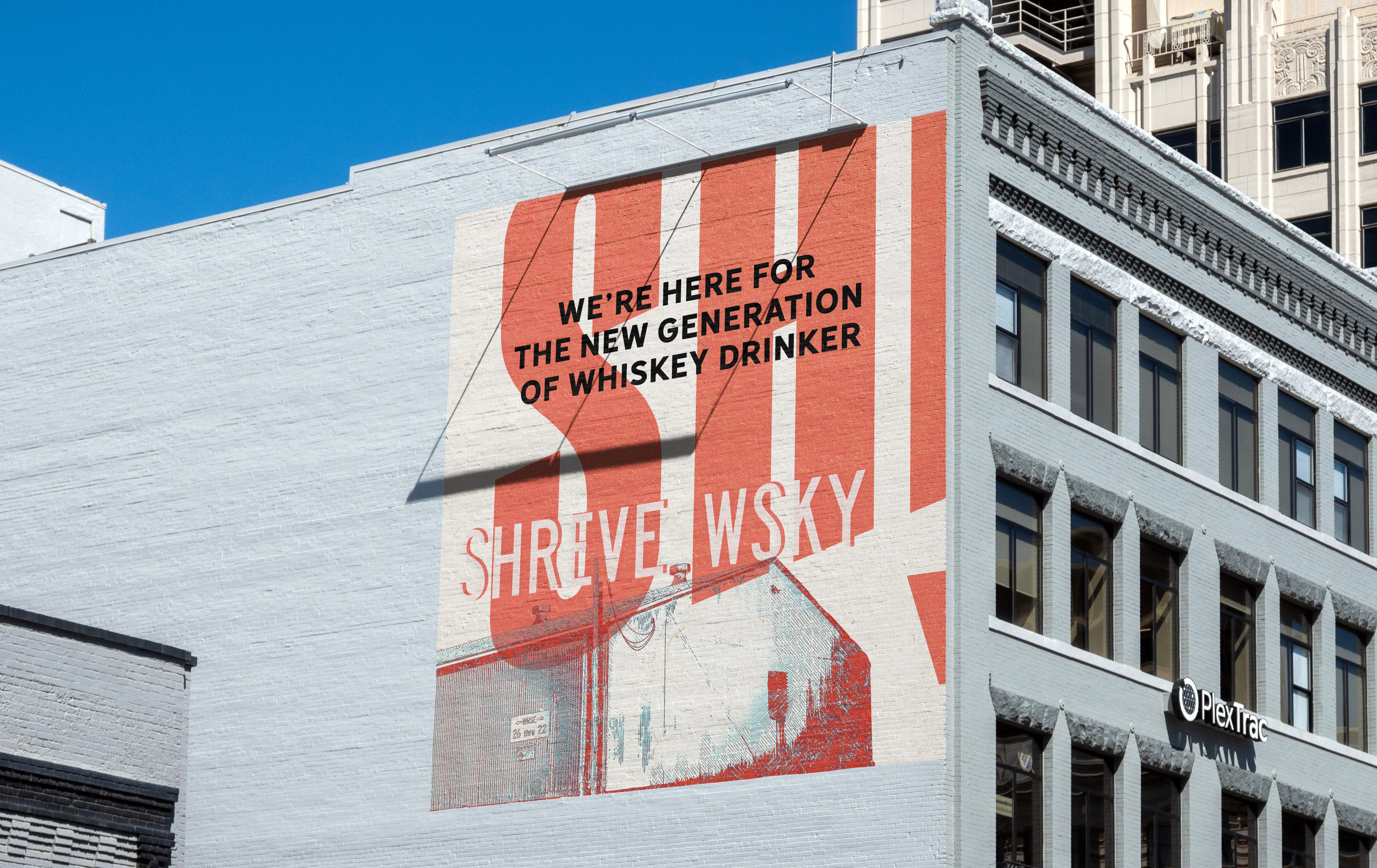
Shreve Whiskey

Vanguards
of American whiskey

Project Scope

Art Direction
Brand Strategy
Copywriting
Visual Identity
Brand Collateral
Website

Art Direction
Brand Strategy
Copywriting
Visual Identity
Brand Collateral
Website
Packaging

Industry

Marketing

Spirits

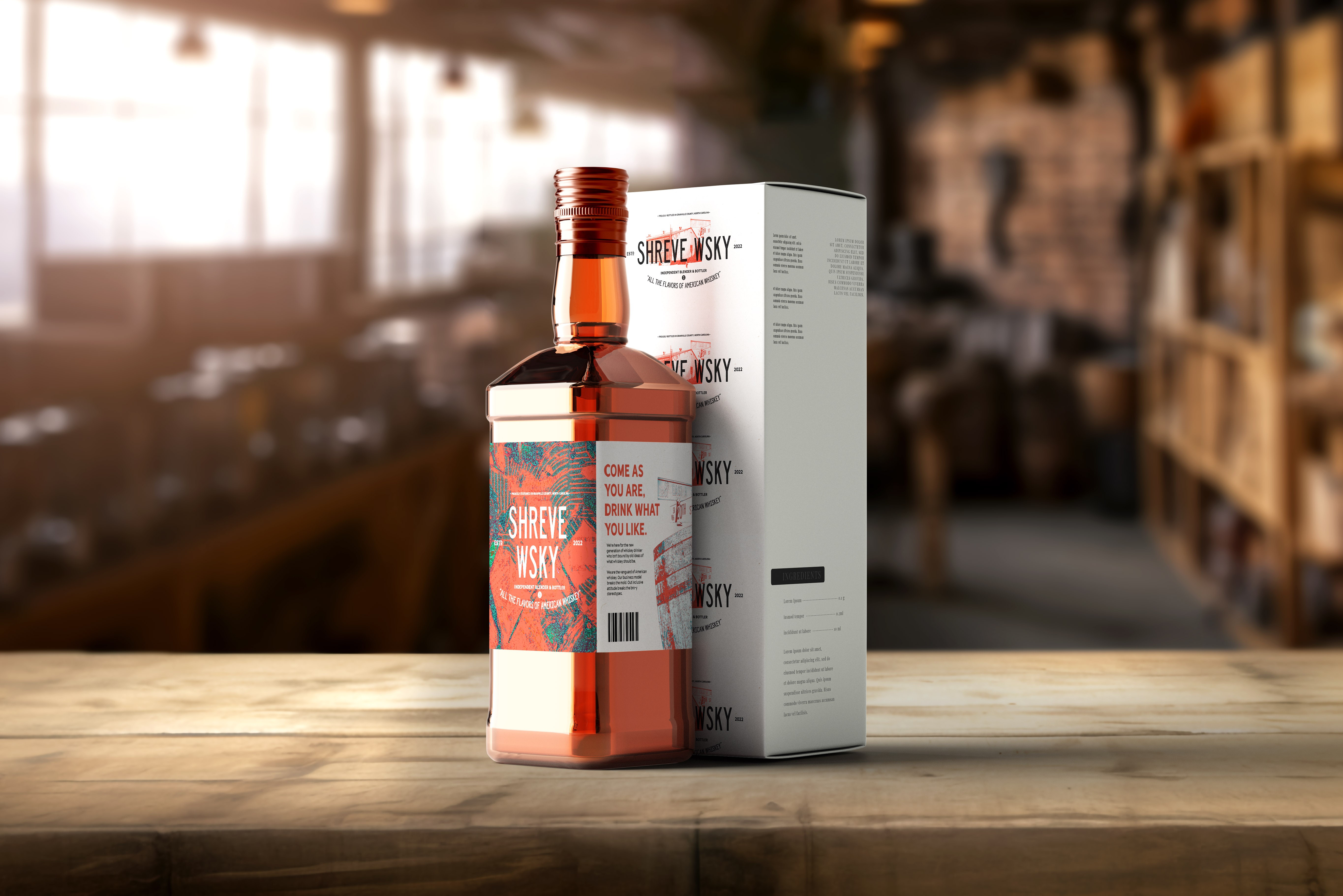
Pretentious. Stuffy. Inaccessible. Those are the words that come to mind when it comes to talking about top shelf, pedigreed whiskey. There’s a spiritual cadence and reverence as many speak of those whiskeys living in rarefied air. And it can feel like a club we can’t get into. A club only for nobility or bored billionaires. Exclusive and elusive. And it’s sad, because great whiskey, if it could speak, would tell us that it wants to be enjoyed, shared and appreciated.


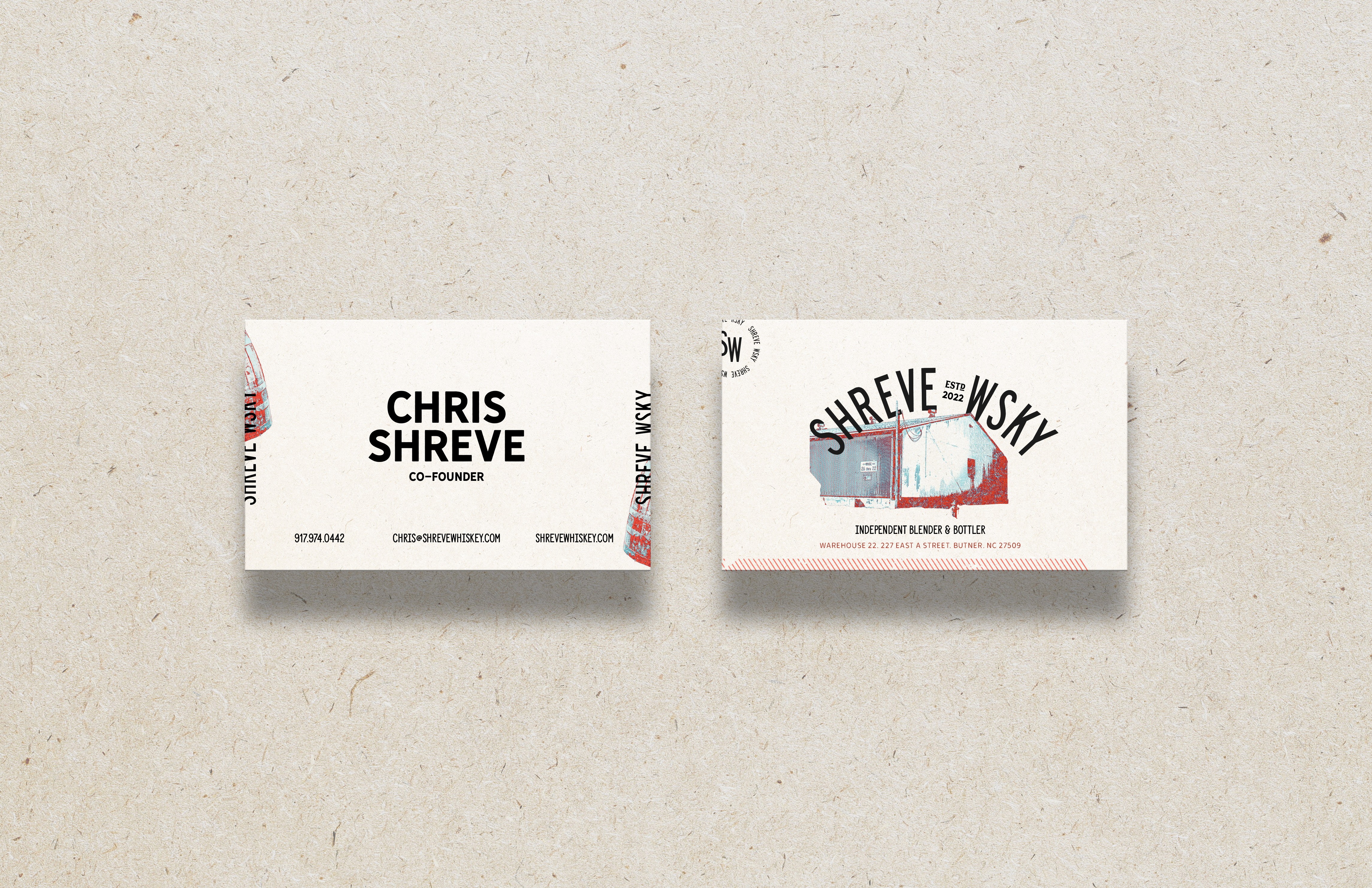
That’s where Shreve Whiskey comes in.


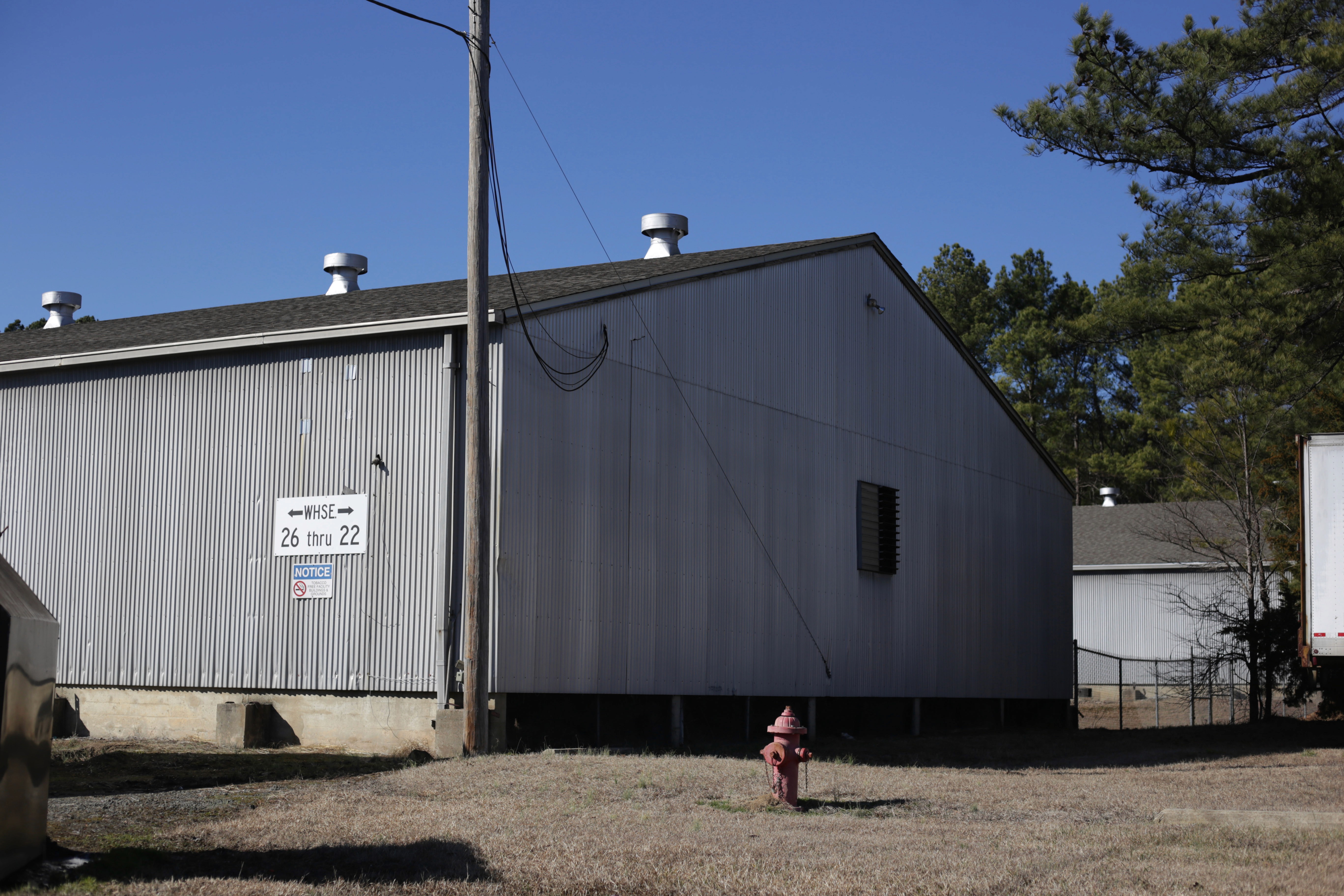
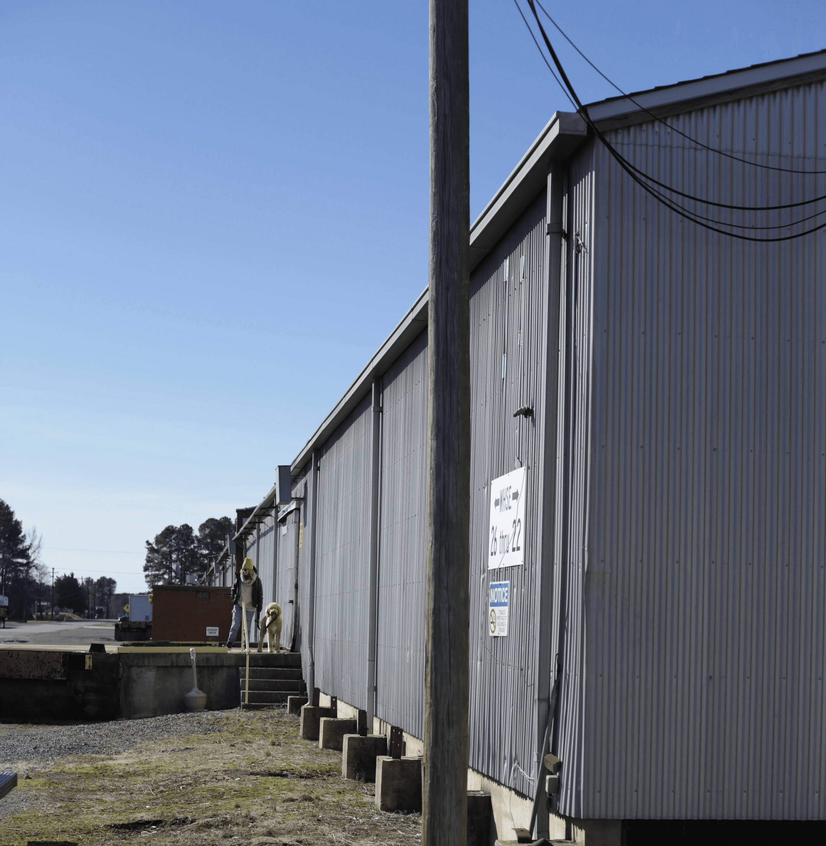
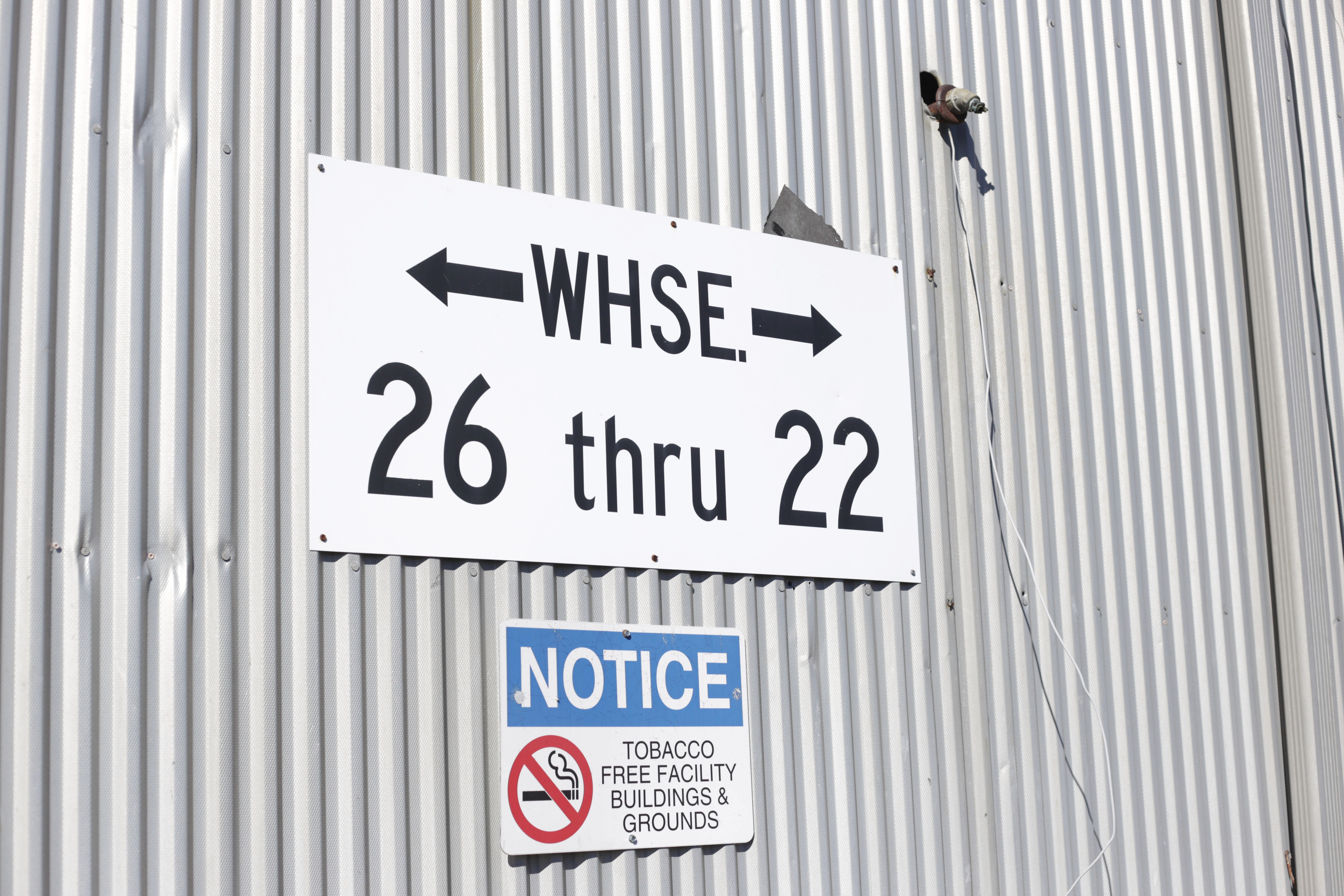
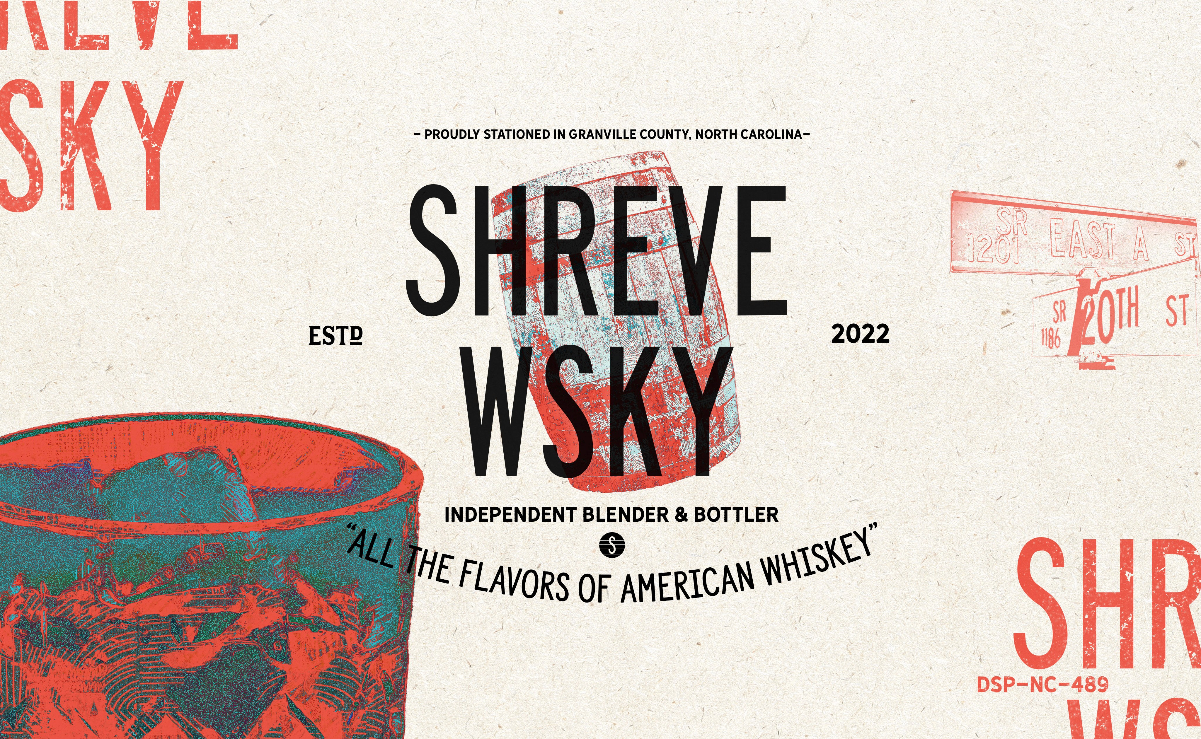
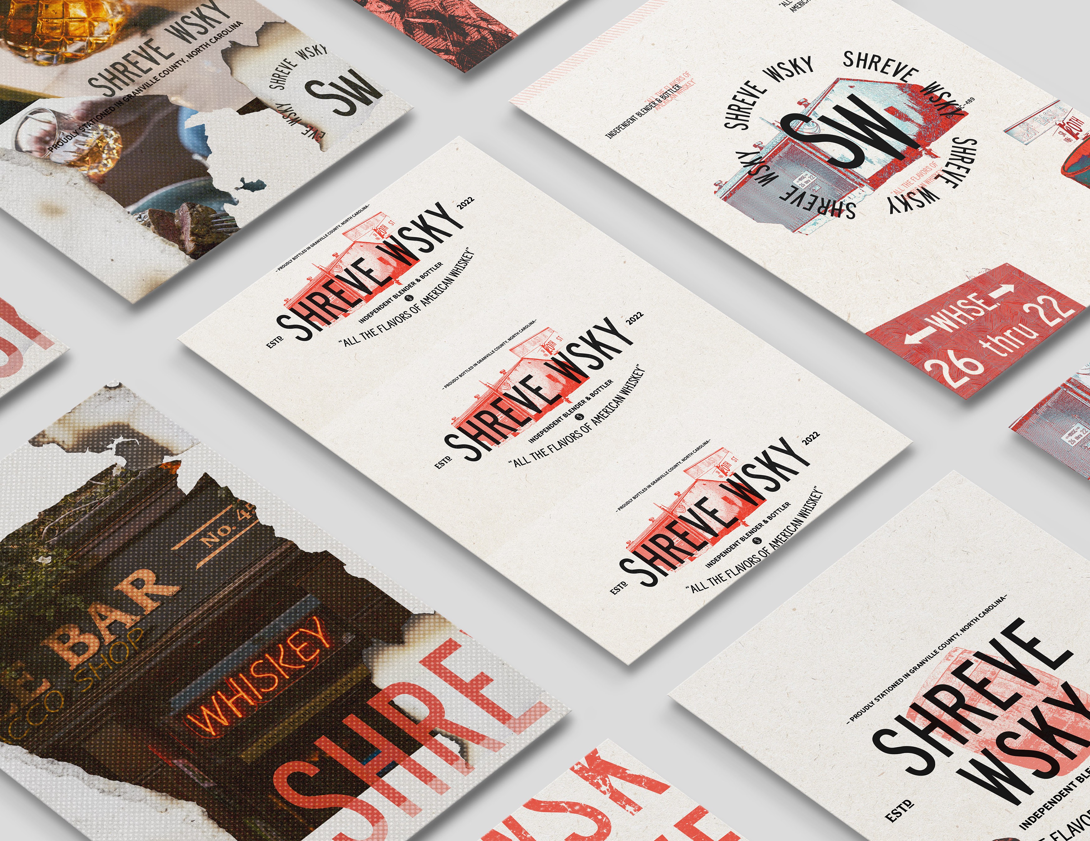
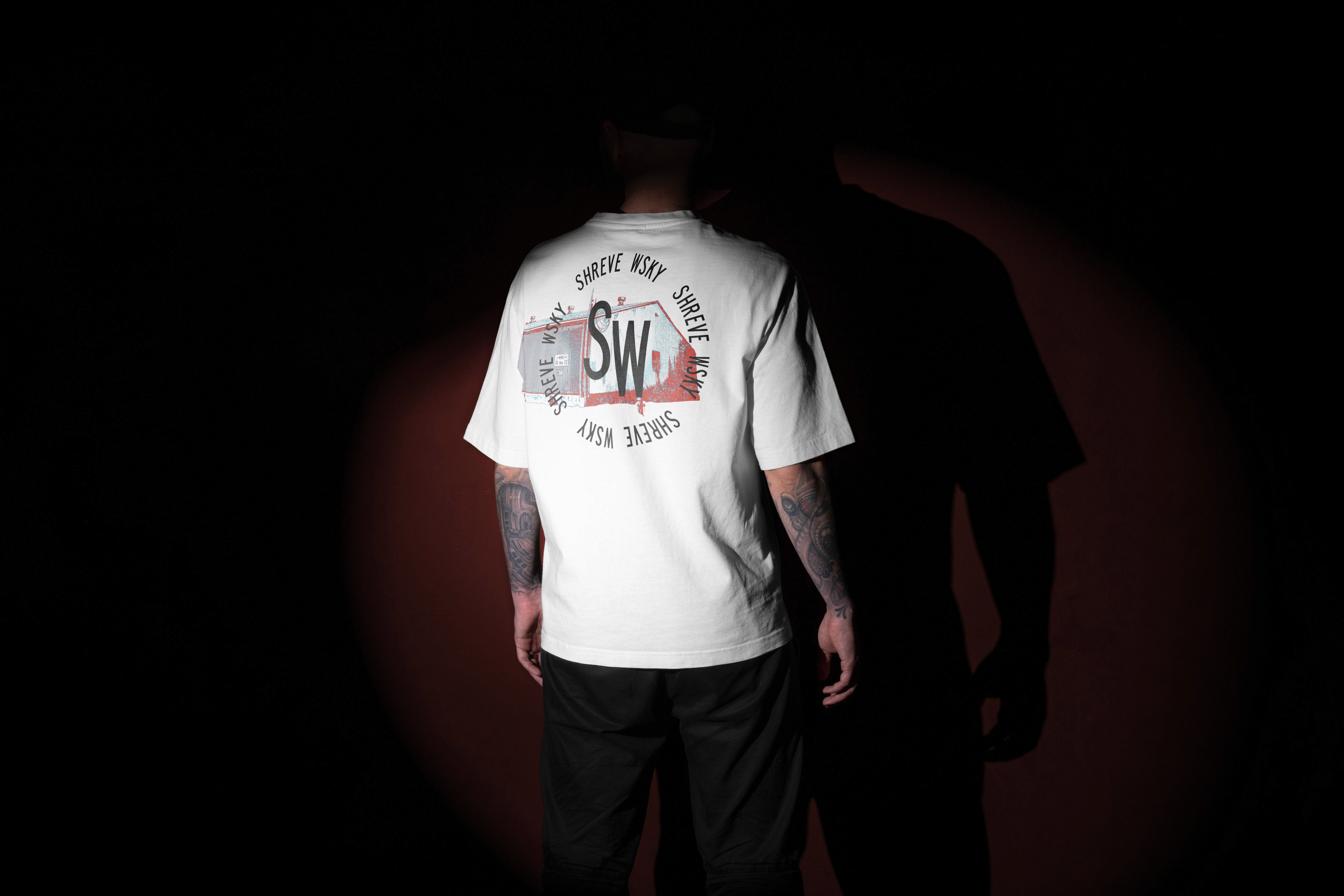
It all comes together at their warehouse in North Carolina, where they’re outfitting and renovating a space to blend, bottle and serve at a custom bar to fellow aficionados and whiskey enthusiasts. And this warehouse is the foundation of the visual identity we created for Shreve Whiskey.


Inspiration

Inspiration

The Shreve Warehouse

The Shreve Warehouse

We modeled their logotype off of the old signage in the warehouse, from the early 1900s and we took photography and created custom illustrations based on the property. Immortalizing the building itself, and other quirks and characteristics like the fire hydrant out front, the signage, whiskey barrels and whiskey on the rocks.

From there we created illustration collages reminiscent of the early days of printing presses, when words and elements where pressed on a canvas or rough paper, textured and full of character, while imperfect and layered with bleeding ink.


Feel like we’re

a good fit

or just have

a few questions?

Schedule a Call

Contact

hello@ppds.studio

Feel like we’re

a good fit

or just have

a few questions?

Schedule a Call

Contact

hello@ppds.studio

Feel like we’re

a good fit

or just have

a few questions?

Schedule a Call

Contact

hello@ppds.studio